Boltron: A Bold Vintage Display Font for Digital Branding
It started with a hero section—just a clean, airy layout for a boutique coaching website, waiting for that one typographic spark. I’d been testing several display fonts, but none landed quite right: some felt too playful, others too stiff or overly ornate. Then I dropped Boltron into the headline field—and everything clicked. That first preview on desktop was striking; the second, on mobile, confirmed it: Boltron isn’t just decorative—it’s intentional, elegant, and digitally resilient.
What Makes Boltron Stand Out in Web Layouts
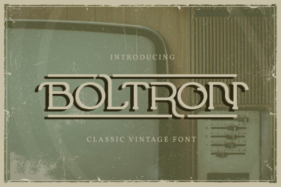
Boltron is a premium display font with unmistakable vintage charm—think mid-century signage meets modern editorial polish. Its bold weight, subtle serifs, and confident letterforms give it presence without shouting. The curves are graceful but grounded; the spacing feels generous, not cramped. Unlike many decorative typefaces, Boltron maintains clarity even at smaller display sizes (think 32–48px on desktop, 28–40px on mobile), especially when paired with sufficient line height and contrast.
Because it’s PUA encoded, all stylistic alternates, ligatures, and special characters load reliably across browsers—no missing glyphs in your live header or broken SVG exports. That’s critical when you’re building reusable design systems or client-facing landing pages where consistency is non-negotiable.
Where Boltron Shines (and Where It Doesn’t)
I tested Boltron across real web contexts: a product landing page for an online herbal apothecary, a portfolio homepage for a ceramicist, and a course sales page for a mindful productivity coach. In every case, it excelled as a hero headline font, section divider, and CTA accent—especially over soft image backgrounds or muted color blocks.
Here’s what worked beautifully:
- Landing page headlines: Boltron gave immediate visual hierarchy—scannable, memorable, and emotionally warm.
- Brand banners: Paired with a light sans serif body font, it anchored the top of the page without overwhelming content.
- Call-to-action buttons: Used sparingly on primary buttons (“Start Your Journey”, “Explore Classes”), it added tactile elegance without sacrificing tap target size.
- Digital brand kits: Clients loved how Boltron elevated mood boards and style guides—feeling both timeless and contemporary.
But—and this matters—I also learned its limits. Boltron isn’t built for long paragraphs, navigation menus, form labels, or small footer text. Its decorative nature reduces legibility below ~20px, and tight tracking can hinder readability in dense UI areas. It’s also not ideal for accessibility-critical interfaces where WCAG contrast ratios must be rigorously maintained without custom adjustments.
Smart Pairing for Real-World Web Projects
Pairing Boltron well is where the magic happens. I consistently reached for a clean, neutral sans serif—like Inter, Manrope, or even system fonts like -apple-system—for body copy and interface elements. This creates a strong visual rhythm: Boltron sets the tone; the sans serif carries the conversation. For more editorial or luxury-leaning sites, a refined serif like Lora or Playfair Display offered subtle harmony without competing.
Avoid pairing Boltron with other high-contrast display fonts or busy scripts—it doesn’t need competition. And while it works beautifully alongside handwritten accents in hero graphics (e.g., a delicate script subheadline), keep those secondary elements subtle and well-spaced.
Responsive Behavior & Technical Considerations
On mobile, Boltron held up better than expected—but only when used intentionally. I resized it down to 26px for secondary headings on iOS Safari and found it remained legible *if* line height stayed at 1.3+ and background contrast was strong (e.g., dark text on off-white, not light gray on beige). Overlaid on image banners? Yes—but always with a subtle text shadow or semi-transparent overlay to ensure readability.
For performance, I converted the OTF to WOFF2 using a trusted webfont generator and loaded it with font-display: swap. Load time stayed under 25KB, and fallback behavior was smooth. Just remember: always test your webfont loading strategy across devices—not just in DevTools’ simulated throttling, but on actual hardware.
Before launching with Boltron on client work or your own shop site, verify licensing covers commercial web use—including SaaS dashboards, email templates, and embedded widgets. Check if variable weights or italic variants are included (Boltron ships as a single bold weight, so plan accordingly). And if your audience includes multilingual users, confirm Latin-extended support—Boltron covers Western and Central European languages well, but doesn’t include Cyrillic or Greek.
More Than a Font—A Brand Tone Anchor
What surprised me most wasn’t how Boltron looked—but how it changed the *feel* of entire layouts. On a wellness brand site, it softened clinical aesthetics with quiet confidence. On a creative studio’s portfolio, it added gravitas without pretension. It didn’t shout “look at me”—it invited attention, then earned it.
That’s the power of a thoughtfully chosen display font: it becomes shorthand for your brand’s voice before a single word is read. Boltron delivers that—cleanly, consistently, and with unmistakable character. If you’re refining a digital identity, launching a new product page, or refreshing a shop’s online presence, Boltron isn’t just another typeface. It’s a deliberate, human-centered design decision—one that makes your message feel both timeless and unmistakably yours.